Support & Help - Dashboard
Key Points
- The dashboard provides a quick graphical overview of work order status
- Click on a graph to drill down to more details
- Use filters to show only the data you want.
- The layout of the dashboard is customizable
Introduction
There are five available dashboard graphs:
- By Category – Useful to see what types of work are happening most frequently
- By Contractor – See the distribution of work amongst your contractors
- By Person – Show how work is divided amongst your staff
- By Place – See which locations are requiring the most work
- By Status – Ideal for examining how large a backlog you have
Dashboard Page
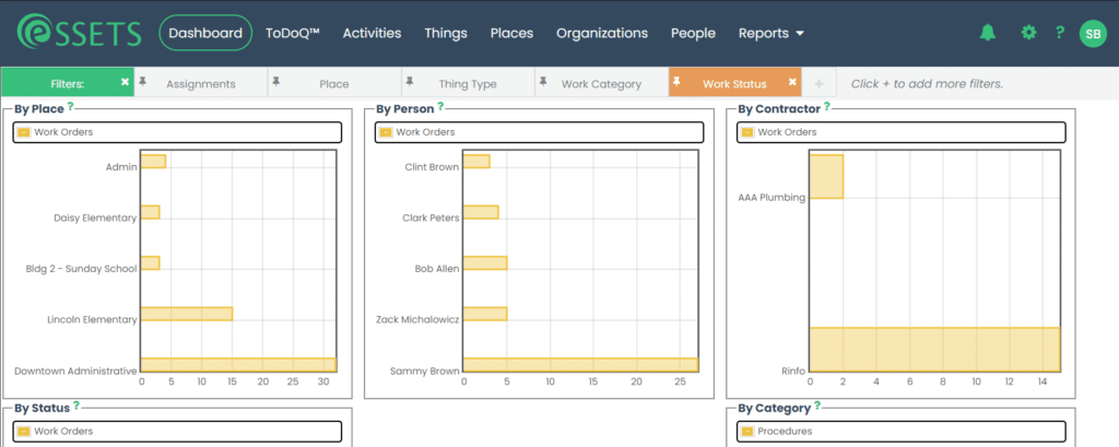
- View the dashboard graphs by clicking Dashboard on the black menu bar.
- Each bar graph starts by showing a name and the corresponding count of open work orders.
- Click the bar graph to drill down to more details about the reported count.
- Read more details about the black menu bar and filters near the top of the page.
Dashboard Drilldown
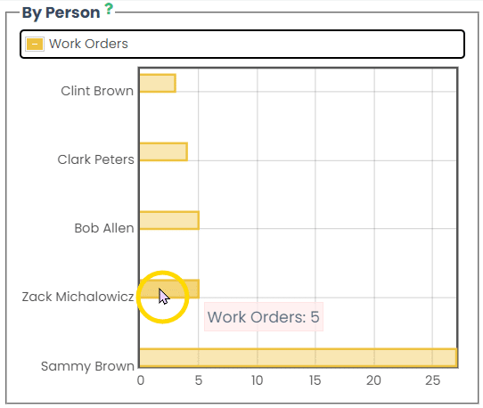
Hover your mouse over any of the bar graphs to see the corresponding count of open work orders. You can see a list of those work orders by clicking on the bar graph.
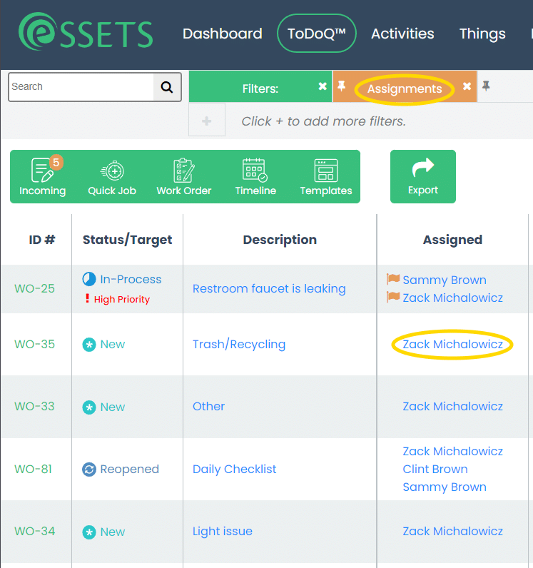
In this example, we clicked on Zack Michalowicz. This takes us to the ToDoQ, which shows us a filtered list of assignments for Zack. Notice the number of work orders shown on the ToDoQ matches the count we saw on the graph.
Dashboard Filters
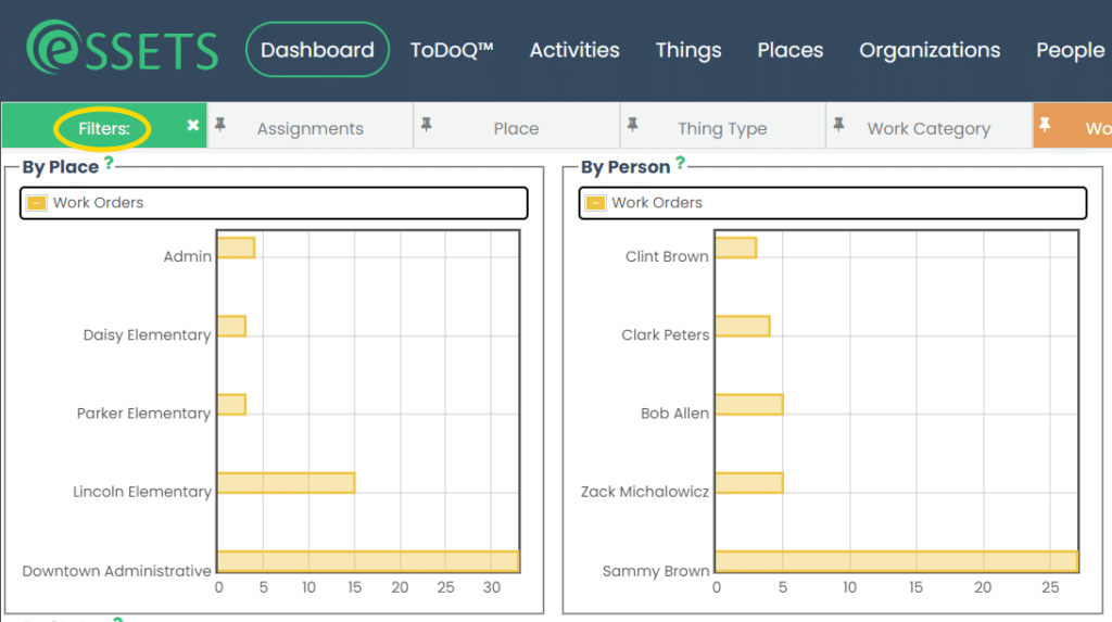
Like most pages, filtering is provided by clicking on the green Filters tab. This shows a list of the filters currently in place.
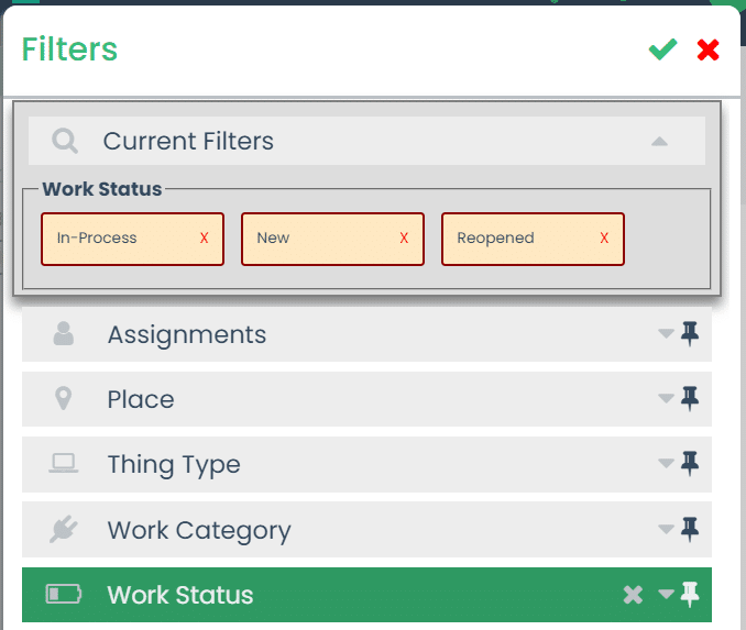
Normally the Dashboard displays new, in-process, and reopened work orders. However, you can click on any of the other filters to narrow it further. For example, you can show the status of all work orders assigned to a certain person or contractor by filtering by that assignment.
Once the filters are as you see fit, just click the green checkbox in the upper-right corner to see the filtered dashboard.
For more details about filtering, please see the Filtering support page.
Customize the Dashboard Layout
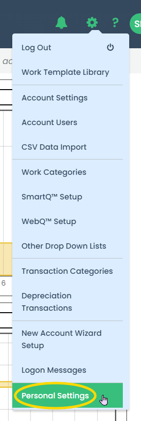
Since each eSSETS user can personalize the app to their liking, you can get started with customizing the dashboard by clicking the Personal Settings menu.
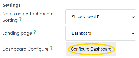
About halfway down the settings page is a button for configuring the dashboard.
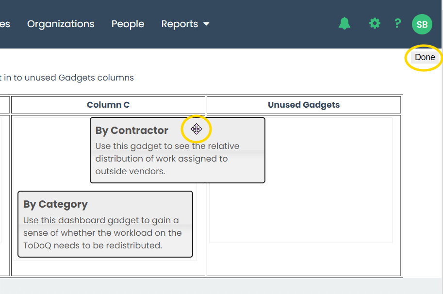
After clicking the button you’ll see four columns. The dashboard shows up to three columns of graphs, columns A, B, and C. The fourth column has the unused graphs.
For example, if your business doesn’t outsource any work, you can eliminate the Contractor graph by moving it to the unused column.
Once you are satisfied with the layout, click the Done button in the upper-right corner.
